Getting Started with Mantine UI
Preface
In 2023, which UI framework should you use for frontend development?
Some basic requirements:
-
PC and mobile support
-
Dark/light theme switching
-
Rich components
-
React support
#4 is a tech stack choice, not universal.
Based on these requirements, let’s quickly search GitHub for React UI libraries
and compare them by stars, issues, last commit time, etc.
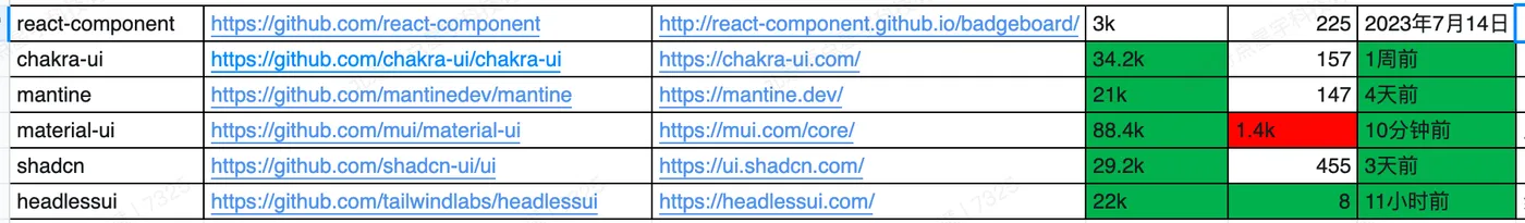
This doesn’t include veteran libraries like Bootstrap or Ant Design — most people are probably tired of those by now.
1. react-component
https://github.com/react-component
Made by the Ant Design team. Combined with CSS frameworks like Tailwind CSS, you can quickly build your own UI framework.
But we’ve used plain Ant Design for too long — pass.
2. Chakra UI
https://github.com/chakra-ui/chakra-ui
Solid all around — shortlisted.
3. Mantine UI
https://github.com/mantinedev/mantine
Solid all around with very rich components — shortlisted.
4. Material UI
https://github.com/mui/material-ui
Too opinionated in style — pass.
5. shadcn
https://github.com/shadcn-ui/ui
Well made, but too few components — pass.
6. Headless UI
https://github.com/tailwindlabs/headlessui
Also well made, but too few components — pass.
Feel free to filter based on your own requirements.
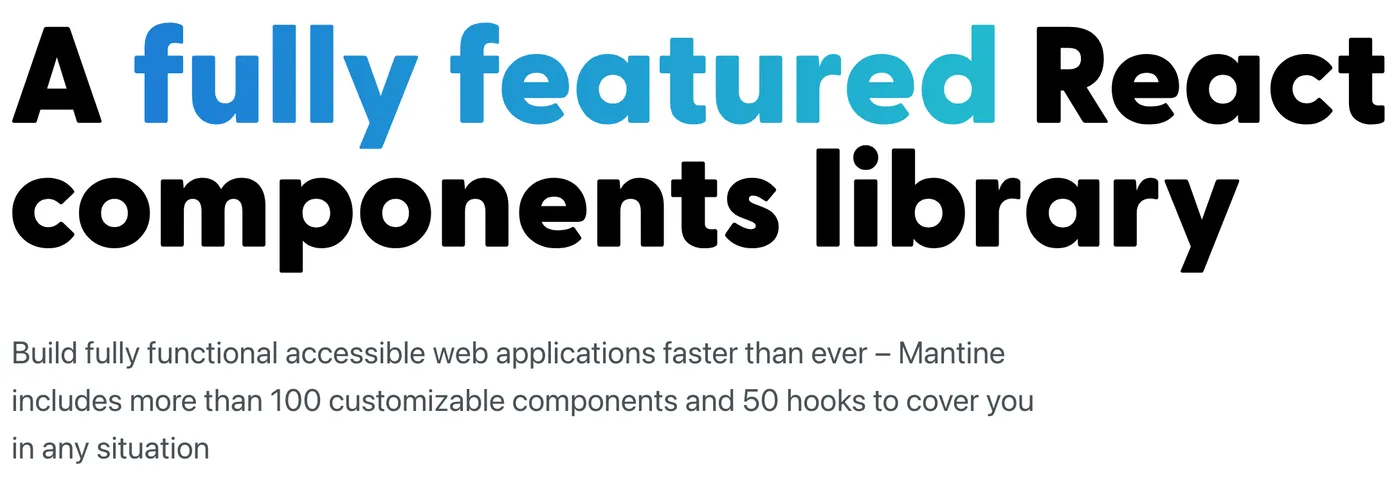
In the end, we chose Mantine UI — mainly because the component library is incredibly rich.
Installation
Mantine UI is divided into core components and optional components.
See: https://mantine.dev/pages/getting-started/
First, install the core components:
npm install @mantine/core @mantine/hooks @emotion/reactAs a React UI library, you need React installed first:
npm install react react-domUsage
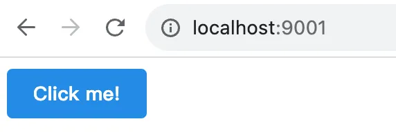
After installation, you can start writing code.
Let’s use the Button component as an example.
First, wrap your root component with MantineProvider:
// react
import React from 'react';
import { createRoot } from 'react-dom/client';
// mantine
import { MantineProvider } from '@mantine/core';
/**
* index view
*/
const IndexView = () => {
return (
<MantineProvider withGlobalStyles withNormalizeCSS>
<div className="container"></div>
</MantineProvider>
);
};
const container = document.getElementById('root');
const root = createRoot(container);
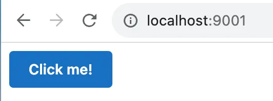
root.render(<IndexView />);Then you can import the Button component:
// react
import React from 'react';

// mantine
import { Button } from '@mantine/core';

/**
 * Index
 */
export const Index = () => {
  return <Button>Click me!</Button>;
};
Result:

Code: https://github.com/insistime/mantine-guides/tree/v0.0.2
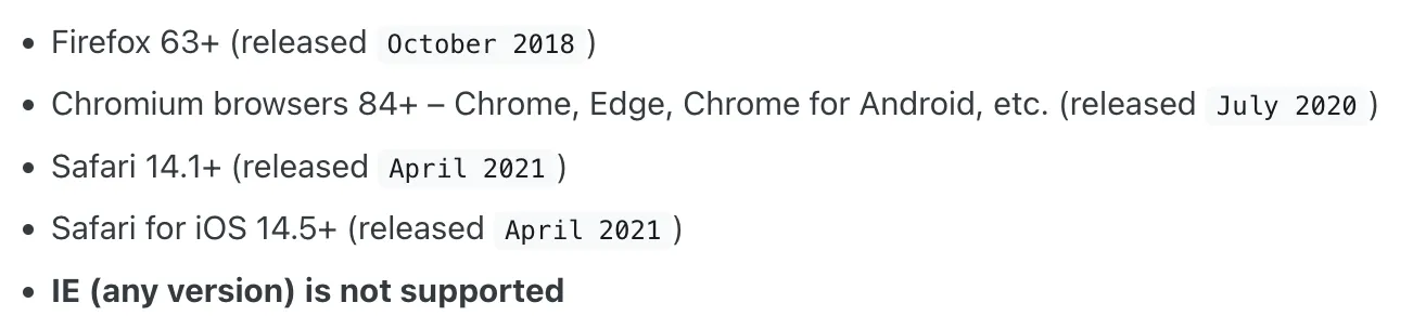
Browser Compatibility
Mantine supports modern browsers but not IE.
If you need IE support, you can integrate polyfills. The official docs aren’t very detailed on this — you’ll need to research on your own.
Common Components
This doesn’t refer to UI components, but common business components.
You can find them here: https://ui.mantine.dev/
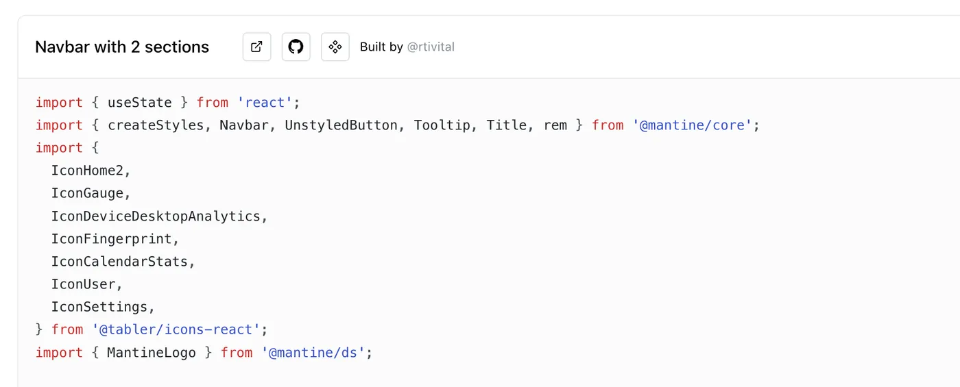
For example, a common sidebar:
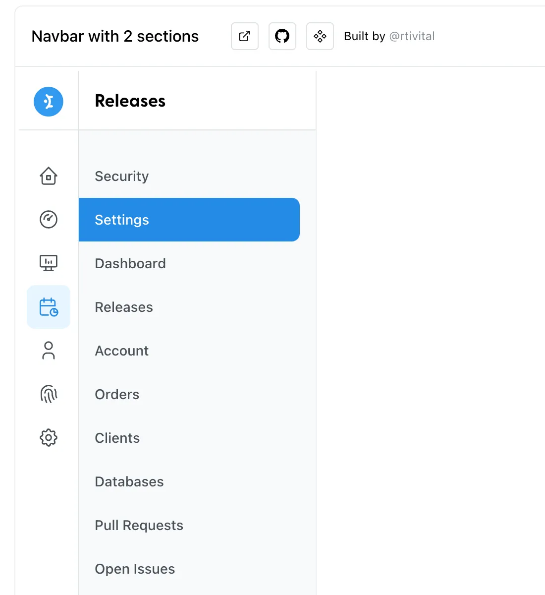
And its code:
Theme
Theme switching is one of the most common frontend requirements.
In Mantine, theme is an object
with many default properties. See: https://mantine.dev/theming/theme-object/
All properties can be customized and overridden.
The following code sets font, spacing, and other properties:
<MantineProvider
  theme={{
    // Override any other properties from default theme
    fontFamily: 'Open Sans, sans serif',
    spacing: { xs: '1rem', sm: '1.2rem', md: '1.8rem', lg: '2.2rem', xl: '2.8rem' },
  }}
>
  <div className="container">
    <Index />
  </div>
</MantineProvider>
Result after setting:
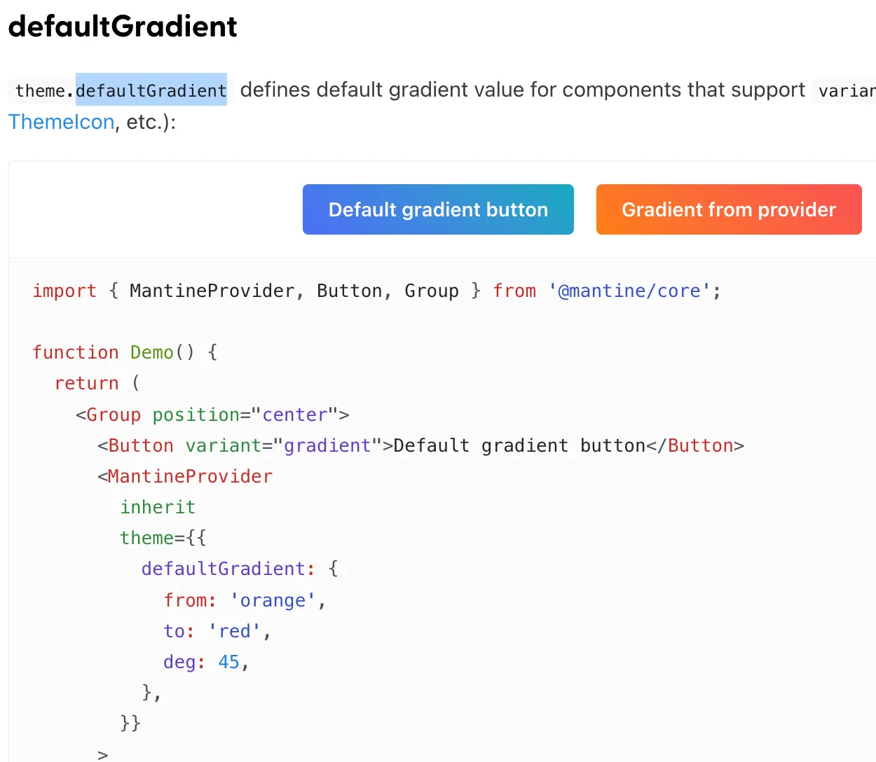
There are also some interesting variables worth mentioning:
defaultGradient
The default gradient color:
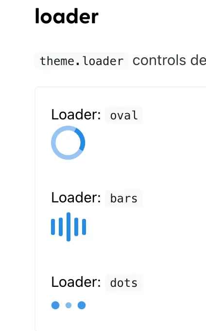
loader
Dark Mode
Based on the principles above, Mantine has adapted all components for light and dark modes.
It’s very easy to use. Here’s dark mode:
<MantineProvider theme={{ colorScheme: 'dark' }}>
  <div className="container">
    <Index />
  </div>
</MantineProvider>
Result:
Code: https://github.com/insistime/mantine-guides/tree/v0.0.3
Common Theme Functions
createStyles
Create styles:
import { createStyles } from '@mantine/core';

const useStyles = createStyles((theme) => ({
  myCustomButton: {
    ...theme.fn.focusStyles(),
  },
}));
useMantineTheme
Get the theme:
import { useMantineTheme } from '@mantine/core';

function Demo() {
  const theme = useMantineTheme();
  return <div style={{ background: theme.fn.linearGradient(45, 'red', 'blue') }} />;
}
fontStyles
Get font styles:
import { createStyles } from '@mantine/core';

const useStyles = createStyles((theme) => ({
  myCustomText: {
    ...theme.fn.fontStyles(),
  },
}));

function MyCustomText() {
  const { classes } = useStyles();
  return <div className={classes.myCustomText}>My custom text</div>;
}
smallerThan & largerThan
Greater than or smaller than a certain size:
import { createStyles } from '@mantine/core';

const useStyles = createStyles((theme) => ({
  myResponsiveText: {
    fontSize: theme.fontSizes.md,

    [theme.fn.smallerThan('sm')]: {
      fontSize: theme.fontSizes.sm,
    },

    [theme.fn.smallerThan(500)]: {
      fontSize: theme.fontSizes.xs,
    },
  },
}));

function Demo() {
  const { classes } = useStyles();
  return <div className={classes.myResponsiveText}>My responsive text</div>;
}
gradient
Gradients:
theme.fn.linearGradient(24, '#000', '#fff'); // -> linear-gradient(24deg, #000 0%, #fff 100%)
theme.fn.linearGradient(133, 'blue', 'red', 'orange', 'cyan', 'white');
// -> linear-gradient(133deg, blue 0%, red 25%, orange 50%, cyan 75%, white 100%)'

theme.fn.radialGradient('#000', '#fff'); // -> radial-gradient(circle, #000 0%, #fff 100%)
theme.fn.radialGradient('blue', 'red', 'orange', 'cyan', 'white');
// -> radial-gradient(circle, blue 0%, red 25%, orange 50%, cyan 75%, white 100%)
More: https://mantine.dev/theming/functions/
MantineProvider
CSS Variables
Mantine supports CSS-in-JS by default,
but also supports CSS variables. Usage:
Add the withCssVariables prop to MantineProvider:
import { MantineProvider } from '@mantine/core';

function Demo() {
  return (
    <MantineProvider withCSSVariables withGlobalStyles withNormalizeCSS>
      <App />
    </MantineProvider>
  );
}
Then you can use them in CSS files:
.my-button {
  background-color: var(--mantine-color-blue-6);
  font-family: var(--mantine-font-family);
  line-height: var(--mantine-line-height);
}
Theme Nesting
Mantine themes can be nested:
import { Button, MantineProvider, Text } from '@mantine/core';

function Demo() {
  return (
    <MantineProvider theme={{ fontFamily: 'Georgia, serif' }}>
      <Text align="center" mb="xs">
        Georgia or serif text
      </Text>

      <MantineProvider theme={{ fontFamily: 'Greycliff CF, sans-serif' }}>
        <Button>Greycliff CF button</Button>
      </MantineProvider>
    </MantineProvider>
  );
}
Styles
You can also modify styles directly:
import { MantineProvider, Group, Button, Badge, ButtonStylesParams } from '@mantine/core';

function Demo() {
  return (
    <MantineProvider
      theme={{
        components: {
          Button: {
            // Subscribe to theme and component params
            styles: (theme, params: ButtonStylesParams, { variant }) => ({
              root: {
                height: '2.625rem',
                padding: '0 1.875rem',
                backgroundColor:
                  variant === 'filled'
                    ? theme.colors[params.color || theme.primaryColor][9]
                    : undefined,
              },
            }),
          },

          Badge: {
            // Use raw styles object if you do not need theme dependency
            styles: {
              root: { borderWidth: '0.125rem' },
            },
          },
        },
      }}
    >
      <Group position="center">
        <Button variant="outline">Outline button</Button>
        <Button variant="filled" color="cyan">Filled button</Button>
        <Badge variant="dot">Dot badge</Badge>
      </Group>
    </MantineProvider>
  );
}
Classes
Also supports adding classes, for use with CSS libraries like Tailwind CSS:
import { MantineProvider, Button } from '@mantine/core';

function App() {
  return (
    <MantineProvider
      withGlobalStyles
      withNormalizeCSS
      theme={{
        components: {
          Button: {
            classNames: { root: 'button-root', label: 'button-label' },
          },
        },
      }}
    >
      <Button>All Button components will have the classes above</Button>
    </MantineProvider>
  );
}
Custom Variants
Common variants like success can also be customized:
import { MantineProvider, Button, Group } from '@mantine/core';

function Demo() {
  return (
    <MantineProvider
      theme={{
        components: {
          Button: {
            variants: {
              danger: (theme) => ({
                root: {
                  backgroundColor: theme.colors.red[9],
                  color: theme.colors.red[0],
                  ...theme.fn.hover({ backgroundColor: theme.colors.red[8] }),
                },
              }),

              success: (theme) => ({
                root: {
                  backgroundImage: theme.fn.linearGradient(
                    45,
                    theme.colors.cyan[theme.fn.primaryShade()],
                    theme.colors.teal[theme.fn.primaryShade()],
                    theme.colors.green[theme.fn.primaryShade()],
                  ),
                  color: theme.white,
                },
              }),
            },
          },
        },
      }}
    >
      <Group position="center">
        <Button variant="danger">Danger variant</Button>
        <Button variant="success">Success variant</Button>
      </Group>
    </MantineProvider>
  );
}
Custom Sizes
Supports custom sizes:
import { MantineProvider, Button, Group } from '@mantine/core';

function Demo() {
  return (
    <MantineProvider
      theme={{
        components: {
          Button: {
            sizes: {
              xxxs: () => ({
                root: {
                  height: '1.25rem',
                  padding: '0.3125rem',
                  fontSize: '0.5rem',
                },
              }),

              xxl: (theme) => ({
                root: {
                  fontSize: '1.75rem',
                  height: '5rem',
                  padding: theme.spacing.xl,
                },
              }),
            },
          },
        },
      }}
    >
      <Group position="center">
        <Button size="xxxs">XXXS button</Button>
        <Button size="xxl">XXL button</Button>
      </Group>
    </MantineProvider>
  );
}
Custom Colors
Mantine’s colors are based on open-color: https://yeun.github.io/open-color/
You can easily customize colors. See: https://mantine.dev/theming/colors/
Custom Fonts
theme.fontFamily — change the font
theme.fontSizes — change font sizes
Styles
Mantine’s styling is based on emotion: https://emotion.sh/docs/introduction
Emotion uses CSS-in-JS. First create a style.js:
// mantine
import { createStyles, getStylesRef, rem } from '@mantine/core';

/**
 * useStyles
 */
export const useStyles = createStyles((theme) => ({
  wrapper: {
    // subscribe to color scheme changes right in your styles
    backgroundColor: theme.colorScheme === 'dark' ? theme.colors.dark[5] : theme.colors.gray[1],
    maxWidth: rem(400),
    width: '100%',
    height: rem(180),
    display: 'flex',
    alignItems: 'center',
    justifyContent: 'center',
    marginLeft: 'auto',
    marginRight: 'auto',
    borderRadius: theme.radius.sm,

    // Dynamic media queries, define breakpoints in theme, use anywhere
    [theme.fn.smallerThan('sm')]: {
      // Child reference in nested selectors via ref
      [`& .${getStylesRef('child')}`]: {
        fontSize: theme.fontSizes.xs,
      },
    },
  },

  child: {
    // assign ref to element
    ref: getStylesRef('child'),
    backgroundColor: theme.colorScheme === 'dark' ? theme.colors.dark[8] : theme.white,
    padding: theme.spacing.md,
    borderRadius: theme.radius.sm,
    boxShadow: theme.shadows.md,
    color: theme.colorScheme === 'dark' ? theme.white : theme.black,
  },
}));
Then use it in a component:
// react
import React from 'react';

// styles
import { useStyles } from './index-styles.js';

/**
 * Index
 */
export const Index = () => {
  const { classes } = useStyles();
  return (
    <div className={classes.wrapper}>
      <div className={classes.child}>createStyles demo</div>
    </div>
  );
};
Result:
Code: https://github.com/insistime/mantine-guides/tree/v0.0.4
Style Props
Mantine has many built-in style props.
See: https://mantine.dev/styles/style-props/
Responsive Design
Mantine supports several approaches to responsive design.
Custom Breakpoints
First, you can define custom breakpoints for responsive layouts:
import { MantineProvider } from '@mantine/core';

function Demo() {
  return (
    <MantineProvider
      withGlobalStyles
      withNormalizeCSS
      theme={{
        breakpoints: {
          xs: '30em',
          sm: '48em',
          md: '64em',
          lg: '74em',
          xl: '90em',
        },
      }}
    >
      <App />
    </MantineProvider>
  );
}
createStyles
Implement responsive design with createStyles — essentially:
-
Pure CSS
-
Theme functions combined with breakpoints
import { createStyles, getBreakpointValue, rem, em } from '@mantine/core';

const useStyles = createStyles((theme) => ({
  container: {
    height: rem(100),
    backgroundColor: theme.colors.blue[6],

    // Media query with value from theme
    [`@media (max-width: ${em(getBreakpointValue(theme.breakpoints.xl) - 1)})`]: {
      backgroundColor: theme.colors.pink[6],
    },

    // Simplify media query writing with theme functions
    [theme.fn.smallerThan('lg')]: {
      backgroundColor: theme.colors.yellow[6],
    },

    // Static media query
    [`@media (max-width: ${em(800)})`]: {
      backgroundColor: theme.colors.orange[6],
    },
  },
}));

function Demo() {
  const { classes } = useStyles();
  return <div className={classes.container} />;
}
MediaQuery
Use Mantine’s MediaQuery component:
<>
  <MediaQuery smallerThan="sm" styles={{ display: 'none' }}>
    <TextInput size="xl" />
  </MediaQuery>

  <MediaQuery largerThan="sm" styles={{ display: 'none' }}>
    <TextInput size="md" />
  </MediaQuery>
</>
Inline
Pure CSS approach:
import { TextInput } from '@mantine/core';

function Demo() {
  return (
    <TextInput
      sx={(theme) => ({
        background: theme.colors.gray[0],
        padding: theme.spacing.md,

        '@media (max-width: 40em)': {
          padding: theme.spacing.sm,
        },
      })}
    />
  );
}
Dark Mode
Custom dark mode colors:
import { MantineProvider } from '@mantine/core';

function Demo() {
  return (
    <MantineProvider
      withGlobalStyles
      withNormalizeCSS
      theme={{
        colorScheme: 'dark',
        colors: {
          // override dark colors to change them for all components
          dark: [
            '#d5d7e0',
            '#acaebf',
            '#8c8fa3',
            '#666980',
            '#4d4f66',
            '#34354a',
            '#2b2c3d',
            '#1d1e30',
            '#0c0d21',
            '#01010a',
          ],
        },
      }}
    >
      <App />
    </MantineProvider>
  );
}
Toggle dark mode automatically:
import { useState } from 'react';
import { MantineProvider, ColorSchemeProvider, ColorScheme } from '@mantine/core';

function Demo() {
  const [colorScheme, setColorScheme] = useState<ColorScheme>('light');
  const toggleColorScheme = (value?: ColorScheme) =>
    setColorScheme(value || (colorScheme === 'dark' ? 'light' : 'dark'));

  return (
    <ColorSchemeProvider colorScheme={colorScheme} toggleColorScheme={toggleColorScheme}>
      <MantineProvider theme={{ colorScheme }} withGlobalStyles withNormalizeCSS>
        <App />
      </MantineProvider>
    </ColorSchemeProvider>
  );
}
Persist to LocalStorage and toggle with keyboard shortcut:
import { MantineProvider, ColorSchemeProvider, ColorScheme } from '@mantine/core';
import { useHotkeys, useLocalStorage } from '@mantine/hooks';

function Demo() {
  const [colorScheme, setColorScheme] = useLocalStorage<ColorScheme>({
    key: 'mantine-color-scheme',
    defaultValue: 'light',
    getInitialValueInEffect: true,
  });

  const toggleColorScheme = (value?: ColorScheme) =>
    setColorScheme(value || (colorScheme === 'dark' ? 'light' : 'dark'));

  useHotkeys([['mod+J', () => toggleColorScheme()]]);

  return (
    <ColorSchemeProvider colorScheme={colorScheme} toggleColorScheme={toggleColorScheme}>
      <MantineProvider theme={{ colorScheme }} withGlobalStyles withNormalizeCSS>
        <App />
      </MantineProvider>
    </ColorSchemeProvider>
  );
}
Follow the user’s system theme:
import { useState } from 'react';
import { MantineProvider, ColorSchemeProvider, ColorScheme } from '@mantine/core';
import { useColorScheme } from '@mantine/hooks';

function Demo() {
  // hook will return either 'dark' or 'light' on client
  // and always 'light' during ssr as window.matchMedia is not available
  const preferredColorScheme = useColorScheme();
  const [colorScheme, setColorScheme] = useState<ColorScheme>(preferredColorScheme);
  const toggleColorScheme = (value?: ColorScheme) =>
    setColorScheme(value || (colorScheme === 'dark' ? 'light' : 'dark'));

  return (
    <ColorSchemeProvider colorScheme={colorScheme} toggleColorScheme={toggleColorScheme}>
      <MantineProvider theme={{ colorScheme }} withGlobalStyles withNormalizeCSS>
        <App />
      </MantineProvider>
    </ColorSchemeProvider>
  );
}
Store in cookie:
// _app.tsx file
import { useState } from 'react';
import NextApp, { AppProps, AppContext } from 'next/app';
import { getCookie, setCookie } from 'cookies-next';
import { MantineProvider, ColorScheme, ColorSchemeProvider } from '@mantine/core';

export default function App(props: AppProps & { colorScheme: ColorScheme }) {
  const { Component, pageProps } = props;
  const [colorScheme, setColorScheme] = useState<ColorScheme>(props.colorScheme);

  const toggleColorScheme = (value?: ColorScheme) => {
    const nextColorScheme = value || (colorScheme === 'dark' ? 'light' : 'dark');
    setColorScheme(nextColorScheme);
    // when color scheme is updated save it to cookie
    setCookie('mantine-color-scheme', nextColorScheme, { maxAge: 60 * 60 * 24 * 30 });
  };

  return (
    <ColorSchemeProvider colorScheme={colorScheme} toggleColorScheme={toggleColorScheme}>
      <MantineProvider theme={{ colorScheme }} withGlobalStyles withNormalizeCSS>
        <Component {...pageProps} />
      </MantineProvider>
    </ColorSchemeProvider>
  );
}

App.getInitialProps = async (appContext: AppContext) => {
  const appProps = await NextApp.getInitialProps(appContext);
  return {
    ...appProps,
    colorScheme: getCookie('mantine-color-scheme', appContext.ctx) || 'light',
  };
};
Polymorphic Components
Some components can have different underlying implementations.
For example, a Button component can be backed by an anchor tag, a Next.js Link component, etc.
Anchor tag:
import { Button } from '@mantine/core';
import { IconExternalLink } from '@tabler/icons-react';

function Demo() {
  return (
    <Button component="a" href="#" variant="outline" leftIcon={<IconExternalLink size="0.9rem" />}>
      Open in new tab
    </Button>
  );
}
Next.js Link component:
// For Next.js 13 and above
import Link from 'next/link';
import { Button } from '@mantine/core';

function Demo() {
  return (
    <Button component={Link} href="/hello">
      Next link button
    </Button>
  );
}
Hooks
Mantine thoughtfully provides a set of built-in hooks for convenience.
See: https://mantine.dev/hooks/use-counter/
Some interesting ones worth highlighting:
Debounce
use-debounced-state
use-debounced-value
Interval
use-interval
use-timeout
Array
use-list-state
Local Storage
use-local-storage
Pagination
use-pagination
System Theme
use-color-scheme
Keyboard Shortcuts
use-hotkeys
Media Query
use-media-query
Clipboard
use-clipboard
Hash
use-hash
Network
use-network
Logger
use-logger
Forms
Forms also come with some common built-in methods:
import { TextInput, Checkbox, Button, Group, Box } from '@mantine/core';
import { useForm } from '@mantine/form';

function Demo() {
  const form = useForm({
    initialValues: {
      email: '',
      termsOfService: false,
    },

    validate: {
      email: (value) => (/^\S+@\S+$/.test(value) ? null : 'Invalid email'),
    },
  });

  return (
    <Box maw={300} mx="auto">
      <form onSubmit={form.onSubmit((values) => console.log(values))}>
        <TextInput withAsterisk label="Email" placeholder="your@email.com" {...form.getInputProps('email')} />

        <Checkbox
          mt="md"
          label="I agree to sell my privacy"
          {...form.getInputProps('termsOfService', { type: 'checkbox' })}
        />

        <Group position="right" mt="md">
          <Button type="submit">Submit</Button>
        </Group>
      </form>
    </Box>
  );
}
Components
Mantine has a very rich component library: