mantine-ui快速上手
【前言】
2023年,前端开发的ui框架应该用哪个呢,
一些基本的诉求:
1.支持pc和移动端
2.支持黑夜&白天主题切换
3.组件丰富
4.支持react
#4是技术栈选择,非通用
按以上要求在github上快速搜索下react相关ui库,
从start数,issues数,最后commit时间等维度做下对比,
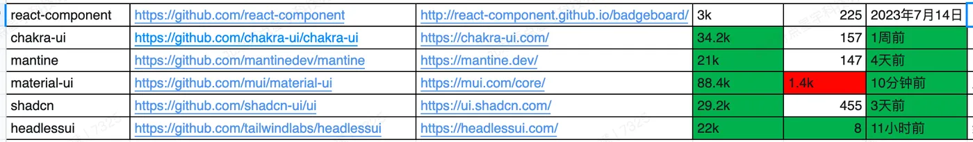
这里没有包括老牌的bootstrap,antd,估计大家都审美疲劳了,
1.react-component
https://github.com/react-component
antd团队出品,配合tailwindcss等css框架可以快速定制自己的ui框架,
单纯的antd用太久了,排除
2.chakra-ui
https://github.com/chakra-ui/chakra-ui
各方面都不错,备选
3.mantine-ui
https://github.com/mantinedev/mantine
各方面都不错,组件很丰富,备选
4.material-ui
https://github.com/mui/material-ui
风格太定制化了,排除
5.shadcn
https://github.com/shadcn-ui/ui
也做的不错,组件有点少,排除
6.headlessui
https://github.com/tailwindlabs/headlessui
同做的不错,组件有点少,排除
大家也可以基于自己的诉求筛选下,
最后确定使用mantine-ui,主要是组件太丰富了。
【安装】
mantine-ui分为基础组件和可选组件,
详见: https://mantine.dev/pages/getting-started/
这里先安装基础组件
npm install @mantine/core @mantine/hooks @emotion/react作为react的ui库,首先要安装react,
npm install react react-dom【使用】
安装后可以开始写代码来了,
先以button组件为例,
首先需要用mantineProvider包一下root组件,
// react
import React from 'react';
import { createRoot } from 'react-dom/client';
// mantine
import { MantineProvider } from '@mantine/core';
/**
* index view
*/
const IndexView = () => {
return (
<MantineProvider withGlobalStyles withNormalizeCSS>
<div className="container"></div>
</MantineProvider>
);
};
const container = document.getElementById('root');
const root = createRoot(container);
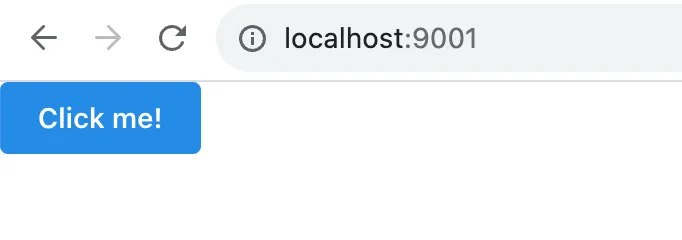
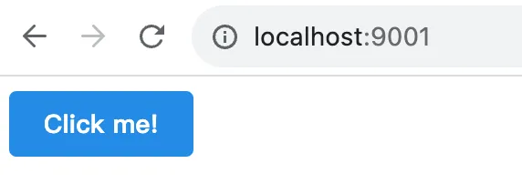
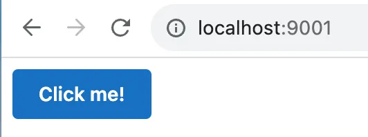
root.render(<IndexView />);然后就可以引入button组件了,
// react
import React from 'react';

// mantine
import { Button } from '@mantine/core';

/**
 * Index
 */
export const Index = () => {
  return <Button>Click me!</Button>;
};
效果如下
代码见: https://github.com/insistime/mantine-guides/tree/v0.0.2
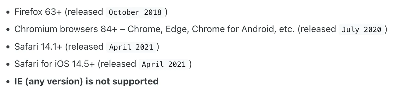
【浏览器兼容】
mantine支持现代浏览器,不支持ie,
如果需要支持可以介入polyfill,官网文档不是很详细,需要的可以自己研究下,
【常见组件】
这里不是指components,而是常见的业务组件,
可以在这里找到, https://ui.mantine.dev/
例如常见的侧边栏,
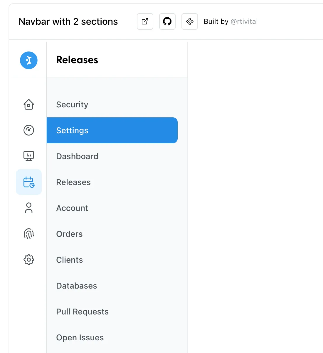
及代码
【theme】
主题切换是前端最常见的需求了,
theme在mantine中是一个object,
默认有很多属性,详见: https://mantine.dev/theming/theme-object/
以上属性都可以自定义覆盖掉,
如下代码设置了字体,间距等属性,
<MantineProvider
  theme={{
    // Override any other properties from default theme
    fontFamily: 'Open Sans, sans serif',
    spacing: { xs: '1rem', sm: '1.2rem', md: '1.8rem', lg: '2.2rem', xl: '2.8rem' },
  }}
>
  <div className="container">
    <Index />
  </div>
</MantineProvider>
设置后效果如下,
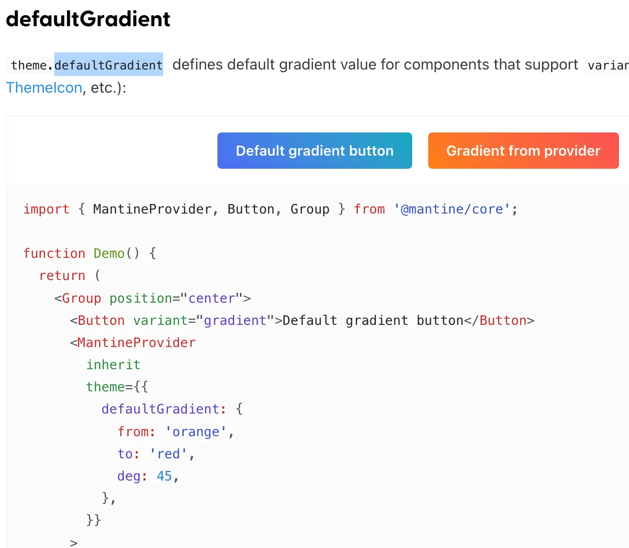
还有一些比较有意思的变量,简单列一下,
defaultGradient
默认的渐变色
loader
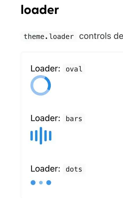
黑夜模式
基于上面的原理,mantine将所有组件适配了白天&黑夜模式,
使用也很方便,如下是黑夜模式
<MantineProvider theme={{ colorScheme: 'dark' }}>
  <div className="container">
    <Index />
  </div>
</MantineProvider>
效果如下
代码见: https://github.com/insistime/mantine-guides/tree/v0.0.3
常见theme函数
createStyles
创建样式
import { createStyles } from '@mantine/core';

const useStyles = createStyles((theme) => ({
  myCustomButton: {
    ...theme.fn.focusStyles(),
  },
}));
useMantineTheme
获取theme
import { useMantineTheme } from '@mantine/core';

function Demo() {
  const theme = useMantineTheme();
  return <div style={{ background: theme.fn.linearGradient(45, 'red', 'blue') }} />;
}
fontStyles
获取字体样式
import { createStyles } from '@mantine/core';

const useStyles = createStyles((theme) => ({
  myCustomText: {
    ...theme.fn.fontStyles(),
  },
}));

function MyCustomText() {
  const { classes } = useStyles();
  return <div className={classes.myCustomText}>My custom text</div>;
}
smallerThan & largerThan
大于或者小于某个尺寸
import { createStyles } from '@mantine/core';

const useStyles = createStyles((theme) => ({
  myResponsiveText: {
    fontSize: theme.fontSizes.md,

    [theme.fn.smallerThan('sm')]: {
      fontSize: theme.fontSizes.sm,
    },

    [theme.fn.smallerThan(500)]: {
      fontSize: theme.fontSizes.xs,
    },
  },
}));

function Demo() {
  const { classes } = useStyles();
  return <div className={classes.myResponsiveText}>My responsive text</div>;
}
gradient
渐变
theme.fn.linearGradient(24, '#000', '#fff'); // -> linear-gradient(24deg, #000 0%, #fff 100%)
theme.fn.linearGradient(133, 'blue', 'red', 'orange', 'cyan', 'white');
// -> linear-gradient(133deg, blue 0%, red 25%, orange 50%, cyan 75%, white 100%)'

theme.fn.radialGradient('#000', '#fff'); // -> radial-gradient(circle, #000 0%, #fff 100%)
theme.fn.radialGradient('blue', 'red', 'orange', 'cyan', 'white');
// -> radial-gradient(circle, blue 0%, red 25%, orange 50%, cyan 75%, white 100%)
更多: https://mantine.dev/theming/functions/
【MantineProvider】
css variables
mantine默认支持css in js的写法,
也支持css variables,用法如下,
mantineProvider上添加withCssVariables属性,
import { MantineProvider } from '@mantine/core';

function Demo() {
  return (
    <MantineProvider withCSSVariables withGlobalStyles withNormalizeCSS>
      <App />
    </MantineProvider>
  );
}
然后可以在css文件中做对应的修改
.my-button {
  background-color: var(--mantine-color-blue-6);
  font-family: var(--mantine-font-family);
  line-height: var(--mantine-line-height);
}
主题嵌套
mantine的theme可以嵌套,如下
import { Button, MantineProvider, Text } from '@mantine/core';

function Demo() {
  return (
    <MantineProvider theme={{ fontFamily: 'Georgia, serif' }}>
      <Text align="center" mb="xs">
        Georgia or serif text
      </Text>

      <MantineProvider theme={{ fontFamily: 'Greycliff CF, sans-serif' }}>
        <Button>Greycliff CF button</Button>
      </MantineProvider>
    </MantineProvider>
  );
}
styles
也可以直接修改样式,如下
import { MantineProvider, Group, Button, Badge, ButtonStylesParams } from '@mantine/core';

function Demo() {
  return (
    <MantineProvider
      theme={{
        components: {
          Button: {
            // Subscribe to theme and component params
            styles: (theme, params: ButtonStylesParams, { variant }) => ({
              root: {
                height: '2.625rem',
                padding: '0 1.875rem',
                backgroundColor:
                  variant === 'filled'
                    ? theme.colors[params.color || theme.primaryColor][9]
                    : undefined,
              },
            }),
          },

          Badge: {
            // Use raw styles object if you do not need theme dependency
            styles: {
              root: { borderWidth: '0.125rem' },
            },
          },
        },
      }}
    >
      <Group position="center">
        <Button variant="outline">Outline button</Button>
        <Button variant="filled" color="cyan">Filled button</Button>
        <Badge variant="dot">Dot badge</Badge>
      </Group>
    </MantineProvider>
  );
}
classes
也支持添加class,配合类似tailwindcss这种css库使用,
import { MantineProvider, Button } from '@mantine/core';

function App() {
  return (
    <MantineProvider
      withGlobalStyles
      withNormalizeCSS
      theme={{
        components: {
          Button: {
            classNames: { root: 'button-root', label: 'button-label' },
          },
        },
      }}
    >
      <Button>All Button components will have the classes above</Button>
    </MantineProvider>
  );
}
定义前缀
常见的一些前缀也支持自定义,例如success等,
import { MantineProvider, Button, Group } from '@mantine/core';

function Demo() {
  return (
    <MantineProvider
      theme={{
        components: {
          Button: {
            variants: {
              danger: (theme) => ({
                root: {
                  backgroundColor: theme.colors.red[9],
                  color: theme.colors.red[0],
                  ...theme.fn.hover({ backgroundColor: theme.colors.red[8] }),
                },
              }),

              success: (theme) => ({
                root: {
                  backgroundImage: theme.fn.linearGradient(
                    45,
                    theme.colors.cyan[theme.fn.primaryShade()],
                    theme.colors.teal[theme.fn.primaryShade()],
                    theme.colors.green[theme.fn.primaryShade()],
                  ),
                  color: theme.white,
                },
              }),
            },
          },
        },
      }}
    >
      <Group position="center">
        <Button variant="danger">Danger variant</Button>
        <Button variant="success">Success variant</Button>
      </Group>
    </MantineProvider>
  );
}
定义大小
支持自定义大小
import { MantineProvider, Button, Group } from '@mantine/core';

function Demo() {
  return (
    <MantineProvider
      theme={{
        components: {
          Button: {
            sizes: {
              xxxs: () => ({
                root: {
                  height: '1.25rem',
                  padding: '0.3125rem',
                  fontSize: '0.5rem',
                },
              }),

              xxl: (theme) => ({
                root: {
                  fontSize: '1.75rem',
                  height: '5rem',
                  padding: theme.spacing.xl,
                },
              }),
            },
          },
        },
      }}
    >
      <Group position="center">
        <Button size="xxxs">XXXS button</Button>
        <Button size="xxl">XXL button</Button>
      </Group>
    </MantineProvider>
  );
}
定义colors
mantine的色值基于open-color, https://yeun.github.io/open-color/
也可以很方便的自定义色值,详见: https://mantine.dev/theming/colors/
定义字体
theme.fontFamily,修改字体
theme.fontSizes,修改字体大小
【styles】
mantine的样式基于emotion, https://emotion.sh/docs/introduction
emotion是css in js的,先创建一个style.js,如下
// mantine
import { createStyles, getStylesRef, rem } from '@mantine/core';

/**
 * useStyles
 */
export const useStyles = createStyles((theme) => ({
  wrapper: {
    // subscribe to color scheme changes right in your styles
    backgroundColor: theme.colorScheme === 'dark' ? theme.colors.dark[5] : theme.colors.gray[1],
    maxWidth: rem(400),
    width: '100%',
    height: rem(180),
    display: 'flex',
    alignItems: 'center',
    justifyContent: 'center',
    marginLeft: 'auto',
    marginRight: 'auto',
    borderRadius: theme.radius.sm,

    // Dynamic media queries, define breakpoints in theme, use anywhere
    [theme.fn.smallerThan('sm')]: {
      // Child reference in nested selectors via ref
      [`& .${getStylesRef('child')}`]: {
        fontSize: theme.fontSizes.xs,
      },
    },
  },

  child: {
    // assign ref to element
    ref: getStylesRef('child'),
    backgroundColor: theme.colorScheme === 'dark' ? theme.colors.dark[8] : theme.white,
    padding: theme.spacing.md,
    borderRadius: theme.radius.sm,
    boxShadow: theme.shadows.md,
    color: theme.colorScheme === 'dark' ? theme.white : theme.black,
  },
}));
然后在组件中使用,
// react
import React from 'react';

// styles
import { useStyles } from './index-styles.js';

/**
 * Index
 */
export const Index = () => {
  const { classes } = useStyles();
  return (
    <div className={classes.wrapper}>
      <div className={classes.child}>createStyles demo</div>
    </div>
  );
};
效果如下:
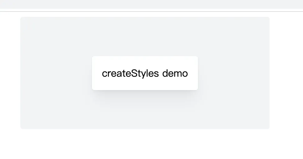
代码见: https://github.com/insistime/mantine-guides/tree/v0.0.4
style props
mantine内置了很多style props,
详见: https://mantine.dev/styles/style-props/
【响应式】
mantine支持几种实现响应式的方法
自定义节点
首先可以自定义节点,如果后续响应式依赖节点的话
import { MantineProvider } from '@mantine/core';

function Demo() {
  return (
    <MantineProvider
      withGlobalStyles
      withNormalizeCSS
      theme={{
        breakpoints: {
          xs: '30em',
          sm: '48em',
          md: '64em',
          lg: '74em',
          xl: '90em',
        },
      }}
    >
      <App />
    </MantineProvider>
  );
}
createStyles
使用createStyles实现响应式,其实就是
1.纯css
2.theme的fn配合节点实现
import { createStyles, getBreakpointValue, rem, em } from '@mantine/core';

const useStyles = createStyles((theme) => ({
  container: {
    height: rem(100),
    backgroundColor: theme.colors.blue[6],

    // Media query with value from theme
    [`@media (max-width: ${em(getBreakpointValue(theme.breakpoints.xl) - 1)})`]: {
      backgroundColor: theme.colors.pink[6],
    },

    // Simplify media query writing with theme functions
    [theme.fn.smallerThan('lg')]: {
      backgroundColor: theme.colors.yellow[6],
    },

    // Static media query
    [`@media (max-width: ${em(800)})`]: {
      backgroundColor: theme.colors.orange[6],
    },
  },
}));

function Demo() {
  const { classes } = useStyles();
  return <div className={classes.container} />;
}
mediaquery
使用mantine的mediaquery组件
<>
  <MediaQuery smallerThan="sm" styles={{ display: 'none' }}>
    <TextInput size="xl" />
  </MediaQuery>

  <MediaQuery largerThan="sm" styles={{ display: 'none' }}>
    <TextInput size="md" />
  </MediaQuery>
</>
inline
纯css实现
import { TextInput } from '@mantine/core';

function Demo() {
  return (
    <TextInput
      sx={(theme) => ({
        background: theme.colors.gray[0],
        padding: theme.spacing.md,

        '@media (max-width: 40em)': {
          padding: theme.spacing.sm,
        },
      })}
    />
  );
}
【黑夜模式】
自定义黑夜模式色值
import { MantineProvider } from '@mantine/core';

function Demo() {
  return (
    <MantineProvider
      withGlobalStyles
      withNormalizeCSS
      theme={{
        colorScheme: 'dark',
        colors: {
          // override dark colors to change them for all components
          dark: [
            '#d5d7e0',
            '#acaebf',
            '#8c8fa3',
            '#666980',
            '#4d4f66',
            '#34354a',
            '#2b2c3d',
            '#1d1e30',
            '#0c0d21',
            '#01010a',
          ],
        },
      }}
    >
      <App />
    </MantineProvider>
  );
}
自动切换黑夜模式
import { useState } from 'react';
import { MantineProvider, ColorSchemeProvider, ColorScheme } from '@mantine/core';

function Demo() {
  const [colorScheme, setColorScheme] = useState<ColorScheme>('light');
  const toggleColorScheme = (value?: ColorScheme) =>
    setColorScheme(value || (colorScheme === 'dark' ? 'light' : 'dark'));

  return (
    <ColorSchemeProvider colorScheme={colorScheme} toggleColorScheme={toggleColorScheme}>
      <MantineProvider theme={{ colorScheme }} withGlobalStyles withNormalizeCSS>
        <App />
      </MantineProvider>
    </ColorSchemeProvider>
  );
}
存储到localstorage&快捷键切换
import { MantineProvider, ColorSchemeProvider, ColorScheme } from '@mantine/core';
import { useHotkeys, useLocalStorage } from '@mantine/hooks';

function Demo() {
  const [colorScheme, setColorScheme] = useLocalStorage<ColorScheme>({
    key: 'mantine-color-scheme',
    defaultValue: 'light',
    getInitialValueInEffect: true,
  });

  const toggleColorScheme = (value?: ColorScheme) =>
    setColorScheme(value || (colorScheme === 'dark' ? 'light' : 'dark'));

  useHotkeys([['mod+J', () => toggleColorScheme()]]);

  return (
    <ColorSchemeProvider colorScheme={colorScheme} toggleColorScheme={toggleColorScheme}>
      <MantineProvider theme={{ colorScheme }} withGlobalStyles withNormalizeCSS>
        <App />
      </MantineProvider>
    </ColorSchemeProvider>
  );
}
跟随用户系统切换
import { useState } from 'react';
import { MantineProvider, ColorSchemeProvider, ColorScheme } from '@mantine/core';
import { useColorScheme } from '@mantine/hooks';

function Demo() {
  // hook will return either 'dark' or 'light' on client
  // and always 'light' during ssr as window.matchMedia is not available
  const preferredColorScheme = useColorScheme();
  const [colorScheme, setColorScheme] = useState<ColorScheme>(preferredColorScheme);
  const toggleColorScheme = (value?: ColorScheme) =>
    setColorScheme(value || (colorScheme === 'dark' ? 'light' : 'dark'));

  return (
    <ColorSchemeProvider colorScheme={colorScheme} toggleColorScheme={toggleColorScheme}>
      <MantineProvider theme={{ colorScheme }} withGlobalStyles withNormalizeCSS>
        <App />
      </MantineProvider>
    </ColorSchemeProvider>
  );
}
设置到cookie内
// _app.tsx file
import { useState } from 'react';
import NextApp, { AppProps, AppContext } from 'next/app';
import { getCookie, setCookie } from 'cookies-next';
import { MantineProvider, ColorScheme, ColorSchemeProvider } from '@mantine/core';

export default function App(props: AppProps & { colorScheme: ColorScheme }) {
  const { Component, pageProps } = props;
  const [colorScheme, setColorScheme] = useState<ColorScheme>(props.colorScheme);

  const toggleColorScheme = (value?: ColorScheme) => {
    const nextColorScheme = value || (colorScheme === 'dark' ? 'light' : 'dark');
    setColorScheme(nextColorScheme);
    // when color scheme is updated save it to cookie
    setCookie('mantine-color-scheme', nextColorScheme, { maxAge: 60 * 60 * 24 * 30 });
  };

  return (
    <ColorSchemeProvider colorScheme={colorScheme} toggleColorScheme={toggleColorScheme}>
      <MantineProvider theme={{ colorScheme }} withGlobalStyles withNormalizeCSS>
        <Component {...pageProps} />
      </MantineProvider>
    </ColorSchemeProvider>
  );
}

App.getInitialProps = async (appContext: AppContext) => {
  const appProps = await NextApp.getInitialProps(appContext);
  return {
    ...appProps,
    colorScheme: getCookie('mantine-color-scheme', appContext.ctx) || 'light',
  };
};
【多态组件】
有一些组件,底层的实现可以是很多种,
比如button组件,底层可以a标签,可以是nextjs的link组件等,
a标签
import { Button } from '@mantine/core';
import { IconExternalLink } from '@tabler/icons-react';

function Demo() {
  return (
    <Button component="a" href="#" variant="outline" leftIcon={<IconExternalLink size="0.9rem" />}>
      Open in new tab
    </Button>
  );
}
nextjs的link组件
// For Next.js 13 and above
import Link from 'next/link';
import { Button } from '@mantine/core';

function Demo() {
  return (
    <Button component={Link} href="/hello">
      Next link button
    </Button>
  );
}
【hooks】
mantine很贴心的封装好了一些hooks,方便大家使用
详见: https://mantine.dev/hooks/use-counter/
一些比较有意思的摘要出来
防抖
use-debounced-state
use-debounced-value
间隔
use-interval
use-timeout
数组
use-list-state
本地存储
use-local-storage
分页
use-pagination
系统theme
use-color-scheme
快捷键
use-hotkeys
媒体查询
use-media-query
剪贴板
use-clipboard
hash
use-hash
network
use-network
日志
use-logger
【forms】
forms也封装了一些常见的方法
import { TextInput, Checkbox, Button, Group, Box } from '@mantine/core';
import { useForm } from '@mantine/form';

function Demo() {
  const form = useForm({
    initialValues: {
      email: '',
      termsOfService: false,
    },

    validate: {
      email: (value) => (/^\S+@\S+$/.test(value) ? null : 'Invalid email'),
    },
  });

  return (
    <Box maw={300} mx="auto">
      <form onSubmit={form.onSubmit((values) => console.log(values))}>
        <TextInput withAsterisk label="Email" placeholder="your@email.com" {...form.getInputProps('email')} />

        <Checkbox
          mt="md"
          label="I agree to sell my privacy"
          {...form.getInputProps('termsOfService', { type: 'checkbox' })}
        />

        <Group position="right" mt="md">
          <Button type="submit">Submit</Button>
        </Group>
      </form>
    </Box>
  );
}
【组件】
mantine组件很丰富,
1.core, https://mantine.dev/core/app-shell/